In 2022, I joined Goodnotes as they aimed to shift 25 million users from a one-time purchase to a subscription model while launching a new app version. The initial in-app pop-up shop proved demand and generated significant revenue quickly, but my role was to turn this temporary setup into a sustainable marketplace for ongoing revenue.
Role: Lead Product Designer
Timeline: 12 months
Contents
01 The Context
When I joined Goodnotes in 2022, the company was attempting something few apps successfully navigate: transitioning 25 million monthly active users from a one-time purchase model to subscriptions while simultaneously launching a new version of their flagship app.
The existing pop-up shop had validated demand—generating a substantial revenue in just months. But it was exactly that: a pop-up. I was hired to transform this experiment into a scalable marketplace that could become a significant revenue stream for the company.
The complexity went deeper than just "adding commerce":
- Launching a new app version — Goodnotes 6
- Shifting to subscription model - From $7.99 one-time to $9.99 recurring subscription
- Establishing marketplace as significant revenue stream - Beyond the pop-up experiment
- Protecting established brand and maintaining ranking on the App Store
- Time constraint – We had only 4 months before engineering cut off
02 The Foundation
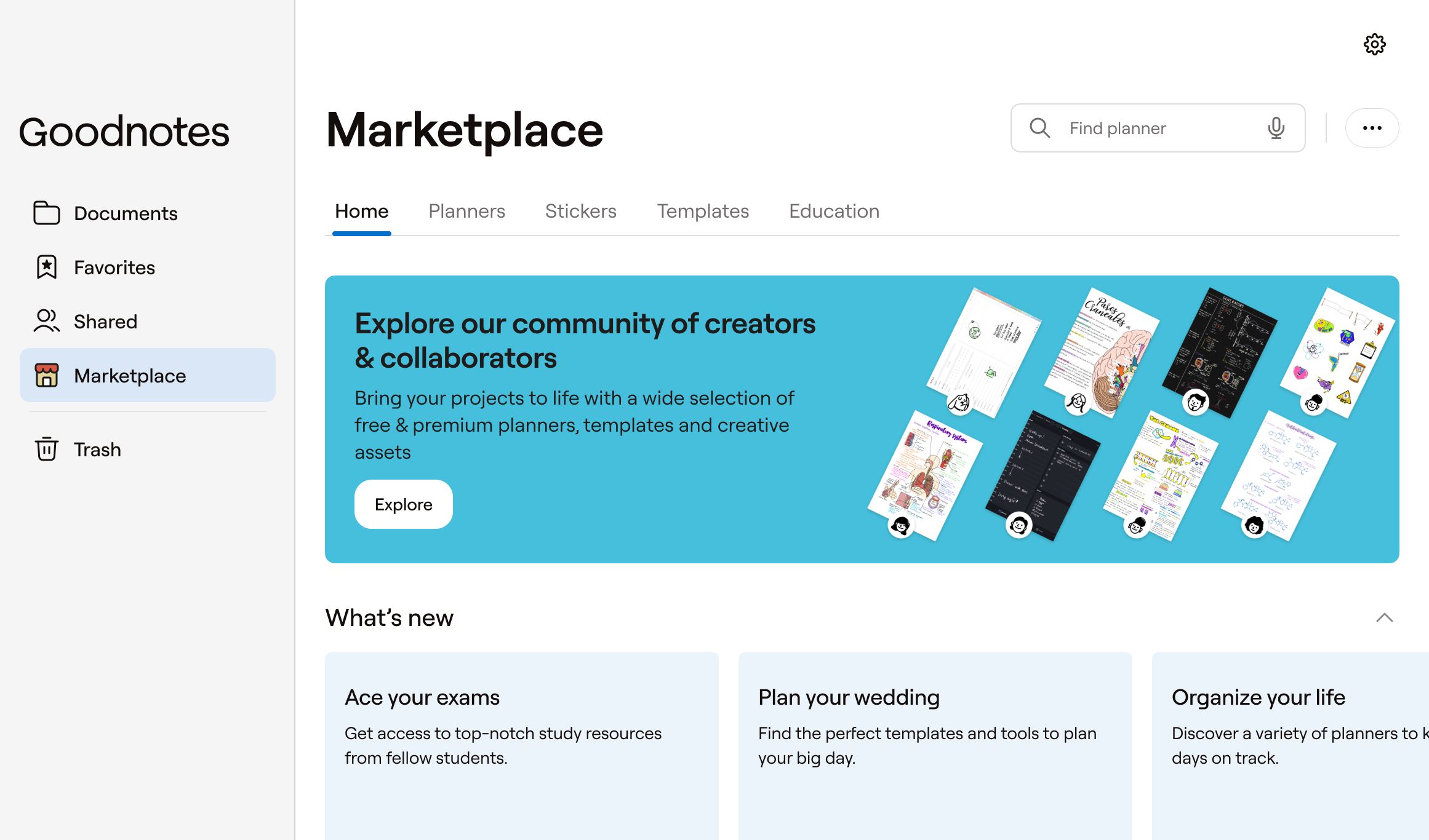
- Competitive Research. I audited dozens of competitor platforms including Notion's templates, Figma Community, and traditional marketplaces like Etsy and Gumroad to understand market patterns.
- Pop-up Shop Performance Analysis. Analyzed the existing pop-up shop to understand what was working, identify scaling bottlenecks, and extract learnings for the full marketplace design.
- Card Sorting. I also ran card sorting sessions to define intuitive IA and understand user mental models around digital content discovery and purchasing.
Insights
- High priceUsers browsed in-app but bought on Etsy due to lower prices. Since Apple's 30% commission makes price competition impossible, marketplace had to offer value Etsy cannot provide.
- Quick Scan Problems Analytics showed users viewed a few items then left. Pop-up layout buried key information, making price and product details hard to find at first glance.
- Student CategoriesCard sorting revealed educational materials (study guides, workbooks) should be clustered separately from lifestyle content. With significant percentage of user base being students, mixing them created cognitive load.
- Free Content AssumptionUser interviews showed expectation that stationery was part of the app purchase, not additional paid content
- Flexible Component SystemSuccessful marketplaces use multiple presentation formats: product carousels for browsing, hero banners for promotions, and category carousels for navigation
03 Design & Implementation
Phase 1. Story Mapping Workshop & Strategy
I facilitated a story mapping workshop with leadership to align on Marketplace goals, user flows, and feature priorities. Worked closely with PM and biz ops team to define their needs and entry points.
Strategic outcome
Marketplace was framed as supporting creators and subscribers rather than pure revenue generation to protect brand during transition
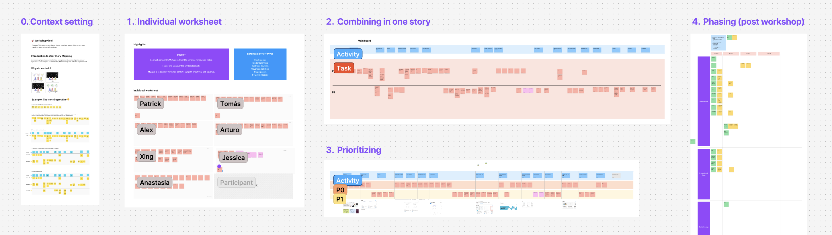
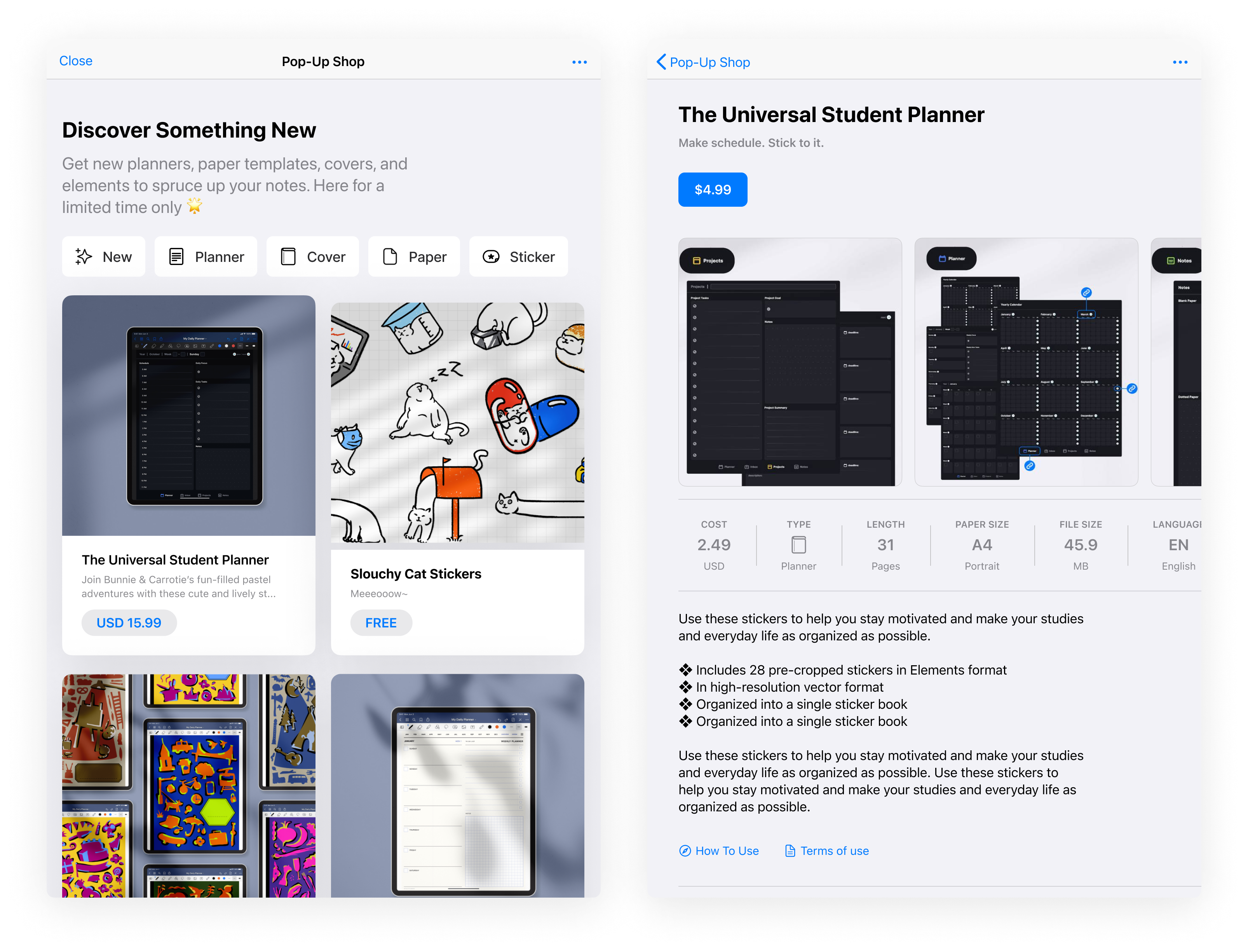
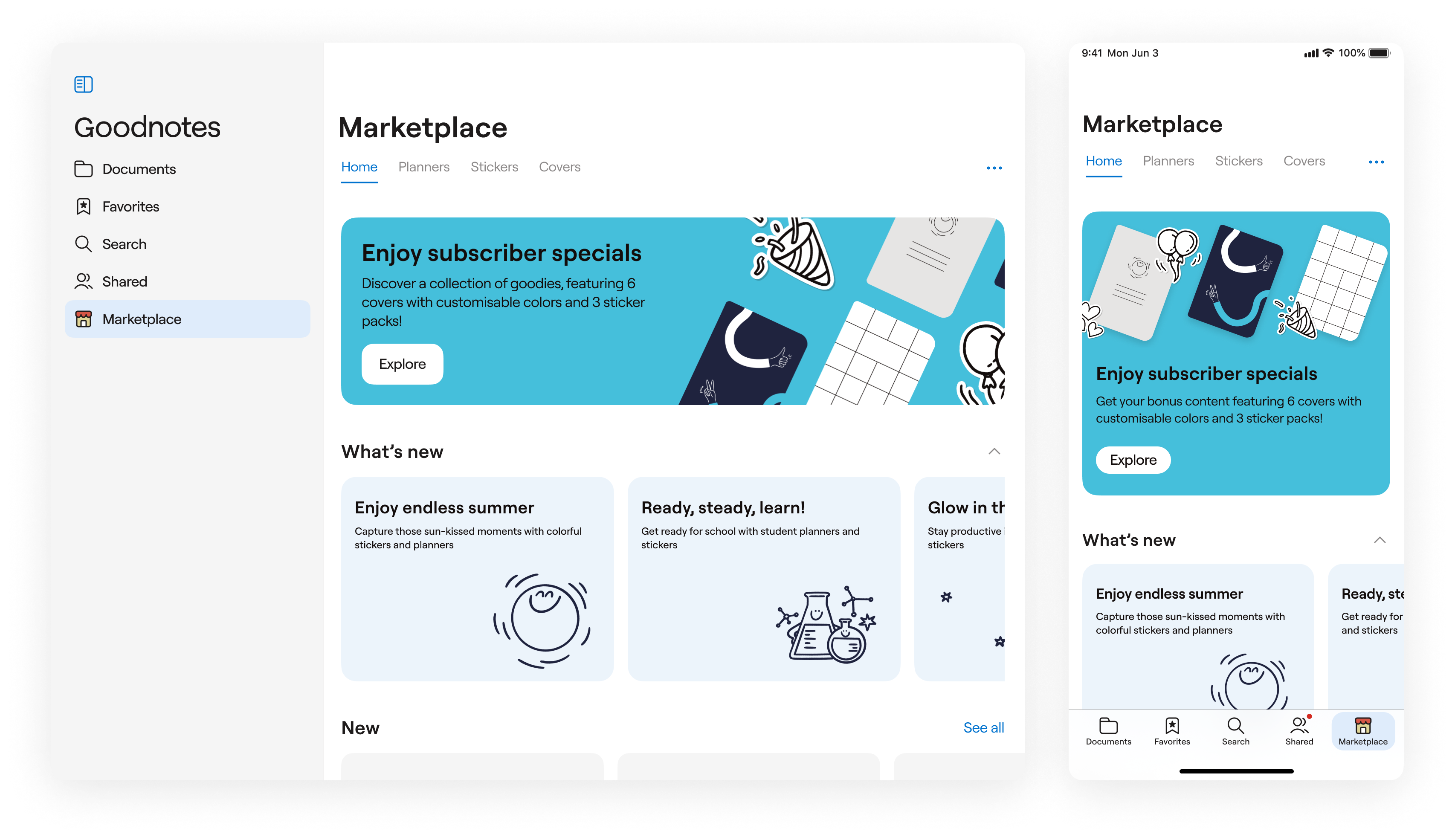
Phase 2. Modular Component Approach
Instead of building fixed marketplace pages, I designed a modular, block-based UI system that could be configured from CMS without engineering or design support. This approach enabled:
- Business autonomy: Business ops were able to manage campaigns independently
- Rapid experimentation: A/B tests without code changes
- Cross-platform consistency: Same components adapted to different platforms
- Clear sprint priorities: Gradient of outcomes instead of binary success/failure with each sprint delivering value
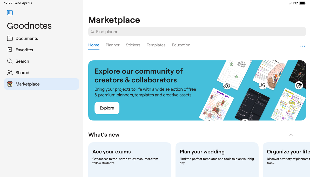
Samsung Galaxy Tab S9 Ultra
Macbook Pro 16’
Why?
Traditional approach would require completing entire pages before launch—a binary success/failure scenario. Component approach transformed this into a gradient of outcomes:
- Worst case: Ship core components, basic marketplace
- Expected case: Ship prioritized components, functional marketplace
- Best case: Ship all components, full-featured marketplace
How we prioritized what to build first
Each component was scored on:
- User value – Does this enable core user jobs?
- Business impact – What is revenue potential and strategic importance?
- Technical complexity – How much engineering effort required?
- Dependencies – What else needs to exist first?
This created clear sprint priorities. Hero banners and product cards shipped first (high value, low complexity). Advanced filtering and purchase history product cards came later (nice-to-have, high complexity/low business impact).
Phase 3: The Subscription-Marketplace Connection
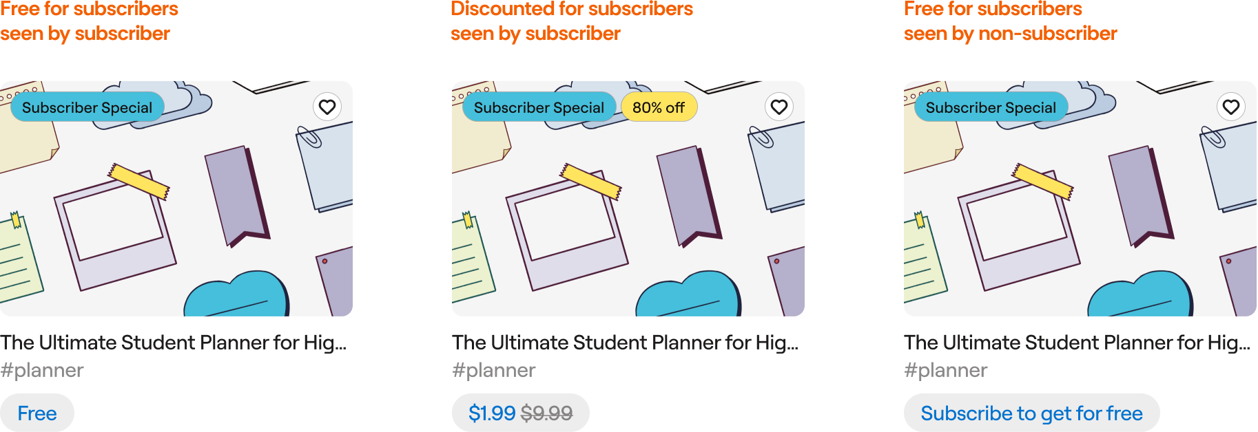
The most critical design decision was how to position marketplace relative to subscriptions. During user interviews, I kept hearing the same concern:
"I already paid for the app, and now you want me to buy stickers too?"
It was a warning about how users perceived our monetization strategy. Instead of fighting this perception, I worked with it. If users felt they'd already paid enough, we needed to give them value that justified their subscription while still creating a sustainable marketplace.
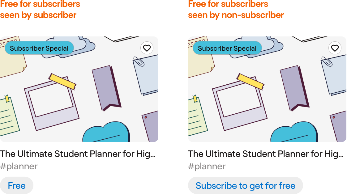
Free Monthly Content for Subscribers
Every subscriber would receive new content packs each month. By releasing fresh content monthly, we created a habit loop: subscribers would visit the marketplace regularly to claim their free items, discover new releases, and often purchase premium content they found while browsing.
The free content was the hook that drove marketplace engagement.
Discounts on Premium Content
Not everything was discounted—that would devalue the marketplace. Instead, we applied subscriber discounts selectively to mid-tier items, while keeping premium partnerships (like Disney) at full price.
This preserved revenue margins on high-value content while still making subscribers feel privileged on everyday purchases.
Exclusive Subscriber Collections
Certain designs would be subscriber-only, unavailable for purchase at any price. Subscribers weren't just getting a discount, they were getting access to content non-subscribers couldn't have.
This created scarcity and made the subscription feel special
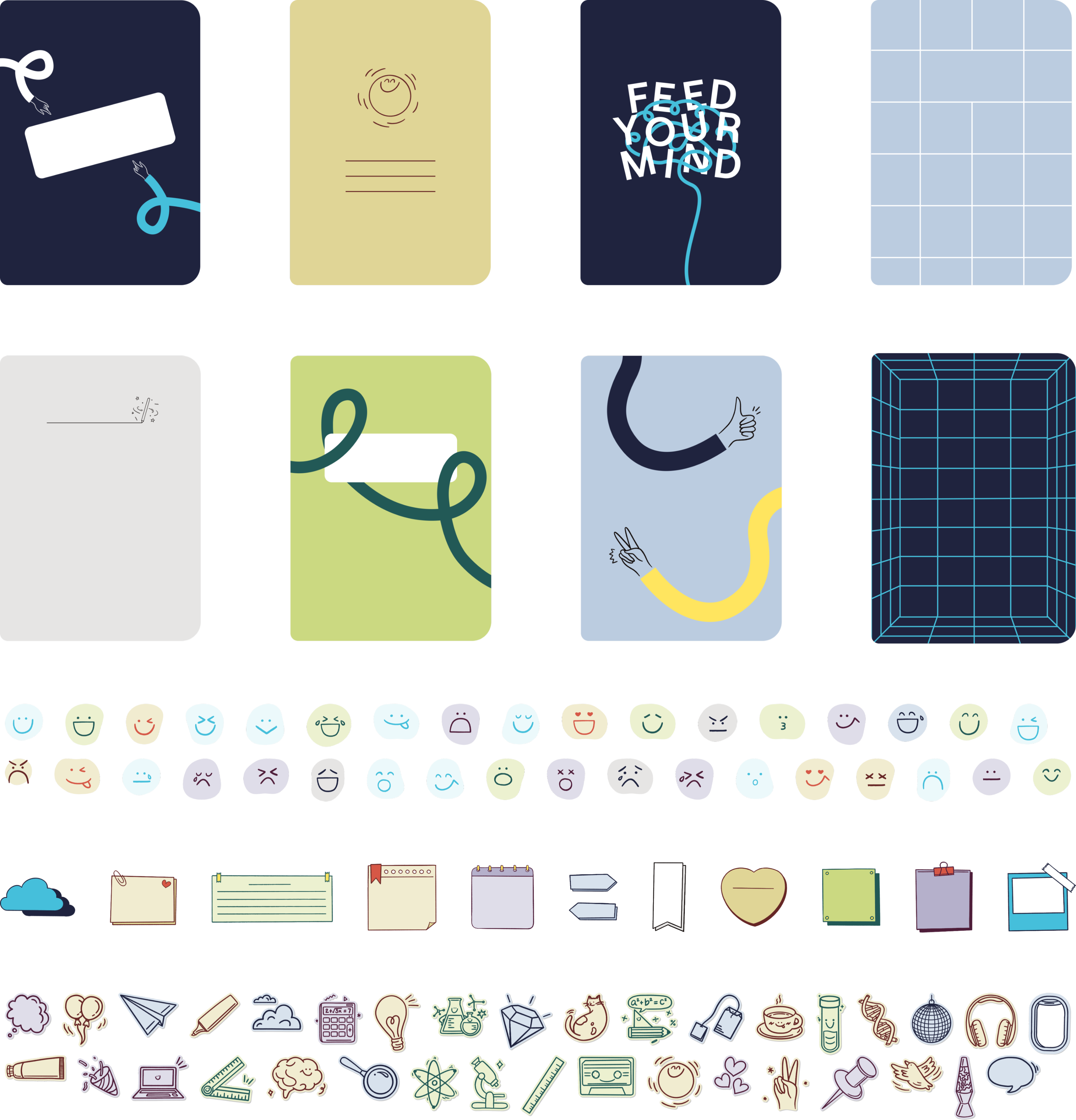
To prove this model worked, I created the launch content myself:
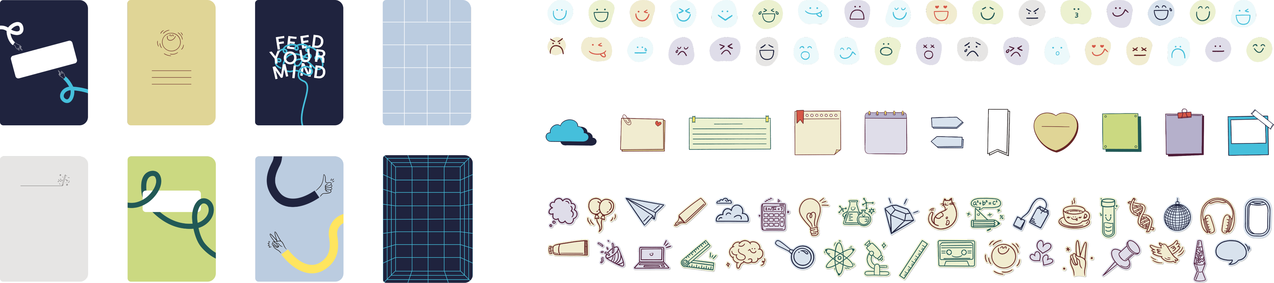
- Notebook cover templates designed specifically for Goodnotes' unique features (responsive layouts, not static PDFs)
- 200+ hand-drawn stickers across 3 themed packs
- All free for subscribers, establishing immediate value and setting quality standards
The impact was immediate and lasting:
- Proved that strategic value-giving drives both subscription loyalty and marketplace revenue
- Free content drove engagement without cannibalizing sales
- These sticker packs remain among the most downloaded items two years later
- Set quality standards for creators on the platform
04 Impact
Expansion to Android, Windows and Web
The initial Marketplace launch on iOS was so successful that it became the blueprint for our cross-platform rollout: we later brought Marketplace to Android as part of the Samsung Galaxy partnership, expanded it to Windows, and even launched a standalone Web Marketplace
Global IP and brand collaborations
Marketplace enabled launches like:
- BTS
- Smurf
- Inside out
- Sanrio “Hello Kitty & Friends”
- Butterbear
- Rilakkuma, Tamagotchi
- Care Bears
It all brought in high-visibility, premium content and incremental licensing revenue.
Marketplace experience and catalog became one of the reasons to invest $1.9M in Webudding (South Korea’s largest digital stationery platform) and to grow a shared content ecosystem across iOS, Android, Windows, and Web
Two years later, the Marketplace’s went cross-platform, had huge partnerships with Disney, BTS, Hello Kitty, generating millions in revenue. The stickers I drew are still top downloads. The component system is a standard.
I’ve learned that a high-pressure environment — tight deadlines, shipping to 25M active users — is where I do my best work, and the impact of this project really proves that
reflection