We'd built an incredible product that teachers loved and students thrived with. Usage was high, engagement metrics were stellar, and classroom results were impressive. Yet renewals were struggling.
This is how building an admin portal from scratch transformed our entire business model.
Role: Lead Product Designer
Timeline: 12 months
Contents
01 The Problem
Market Context
Happy Numbers is a Pre-K - 5 supplementary math education space with a fundamental disconnect: the product users (teachers and students) have zero influence over purchasing decisions, while the decision-makers (administrators) never actually use the product.
What Everyone Believed
- If teachers love it and students improve, renewals would follow naturally
- Admins would trust teacher feedback and student outcomes
- The occasional CSV export was sufficient for enterprise buyers
The Surface Issue
Our Customer Success team was burning out, creating manual CSV exports for every district three times a year. Admins had no dedicated portal—they were literally using teacher credentials to peek at individual classrooms, trying to piece together district-wide performance.
The First (Wrong) Solution
"Let's just aggregate the teacher dashboard data!" Simple, right? Take what teachers see for their 30 students and roll it up for administrators' 3,000 students. We launched this quickly as a proof of concept. Concept worked, but metrics didn’t...
02 The First Reality Check
After launching our "solution," user interviews revealed an uncomfortable truth: admins couldn't understand what they were looking at. The metrics that made perfect sense to teachers—"target completion rates," "time spent on platform"—were meaningless to someone presenting to a school board.
"What does 85% completion mean? Is it how many students achieved their target or on avarage student achieved their target to 85%?"
“I can't present a number to the board if I can't explain what it means.”
The Metrics Mismatch
Remeber, we agregated date from teacher account to admin.
The teacher dashboard showed: 'This week, 78% of your students completed their daily targets.' Teachers understood this because they set those task targets.
But when admins saw the district-wide version — '65% of students are completing daily targets with varying time spent' — they were lost. What's a target? Is it good or should they be worried?
The Breakthrough Moment
One administrator said during testing:
“I don't care if they spent 30 or 60 minutes. I care if they're ready for state testing.”
This reframed everything. We weren't just aggregating data wrong—we were treating admins as teachers, but their needs are different.
03 The Solution Journey
Phase 1. Strategy
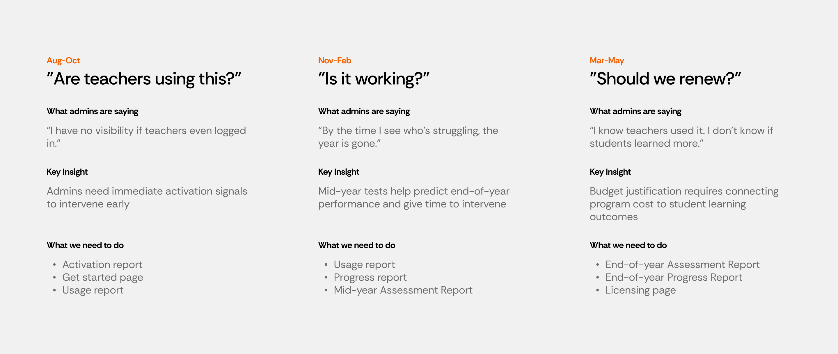
Mapping the academic year from admin perspective showed administrator needs throughout the year:
- September-October: "Are teachers actually using this?" (Activation focus)
- November-February: "Is it working?" (Usage & Progress focus)
- March-May: "Should we renew?" (Outcomes & ROI focus)
- June-August: "What's our plan for next year?" (Planning focus)
Phase 2. Usage Metrics Redesign (First Priority)
Usage was the report admins requested most frequently—not because it was most valuable, but because it was the only way they could answer the basic question: "Is anyone even using this thing we paid for?"
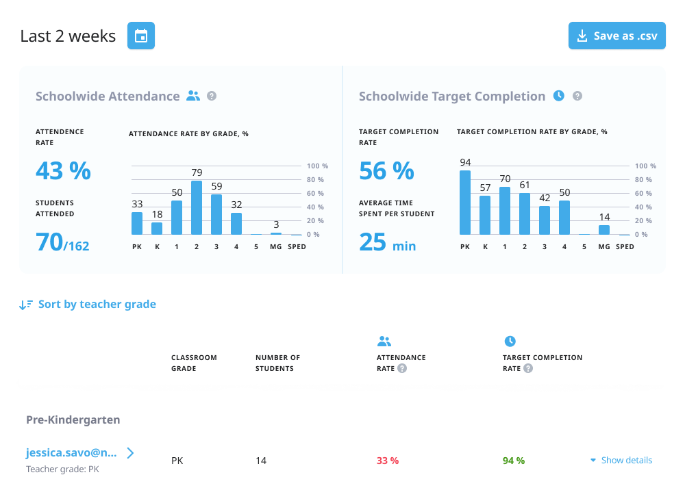
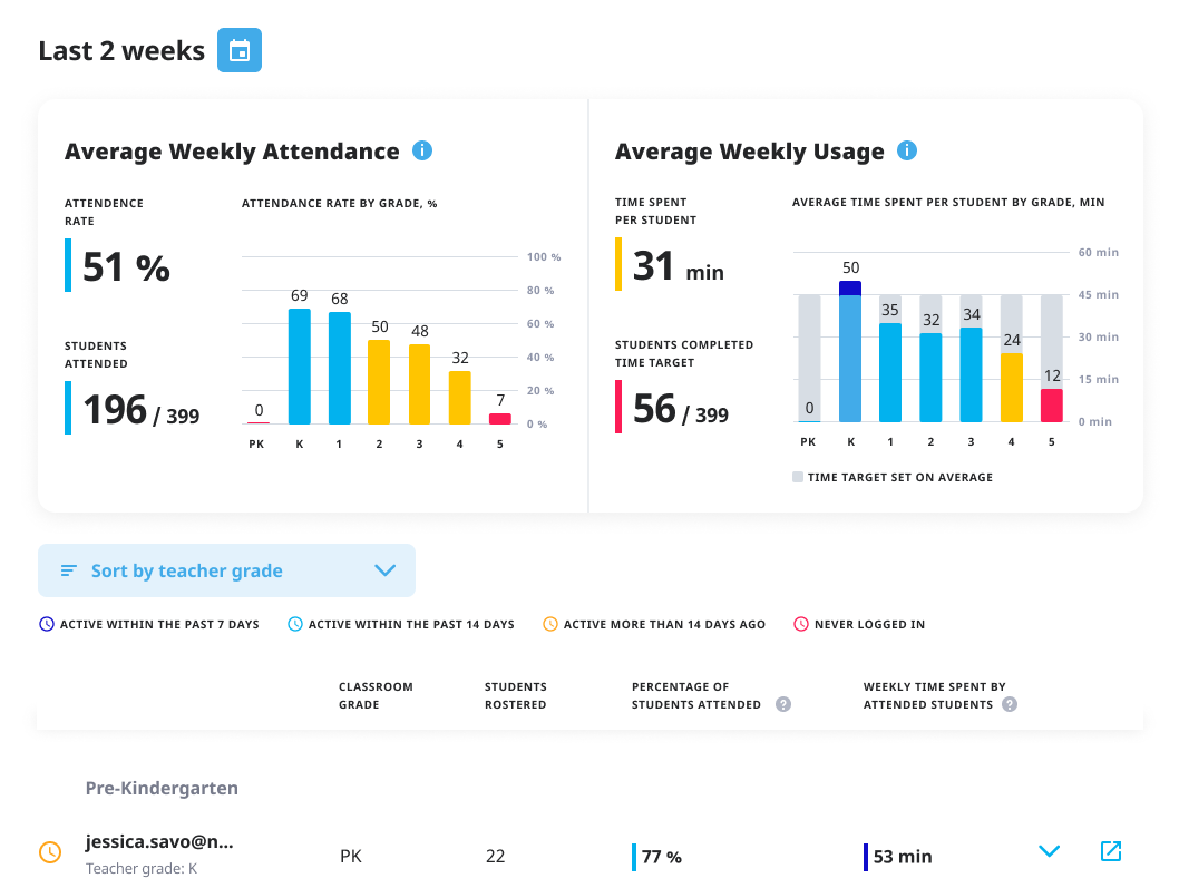
Before
After
Killed
"Target completion rate" - a percentage of students who achieved their individualized targets set by teachers.
Too ambiguous, required too much context
Added
- Weekly Usage - how much time students actually spent learning.
- Color coding that actually means something
- dark blu = exceeded goals
- blue = meeting goals
- yellow = close
- red = needs attention
Phase 3: Building Reports for the Academic Calendar
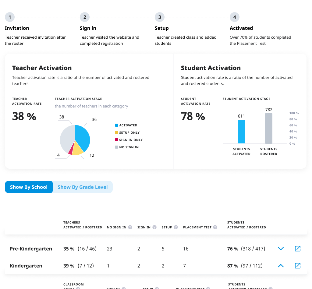
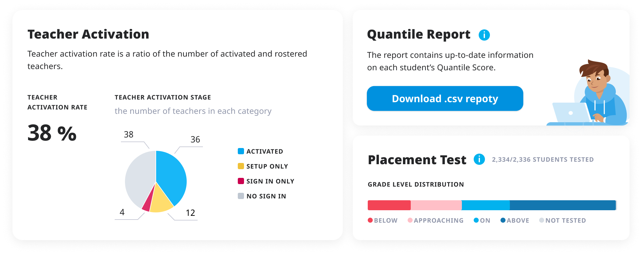
The Activation Report (For Fall Setup Season):
The Problem: In September, admins don't care about student progress—they care if teachers are even using the platform
What We Built: Teacher-by-teacher activation tracking showing who completed setup, who created classes, who assigned work
Why It Mattered: Admins could intervene early instead of discovering in January that half their teachers never started
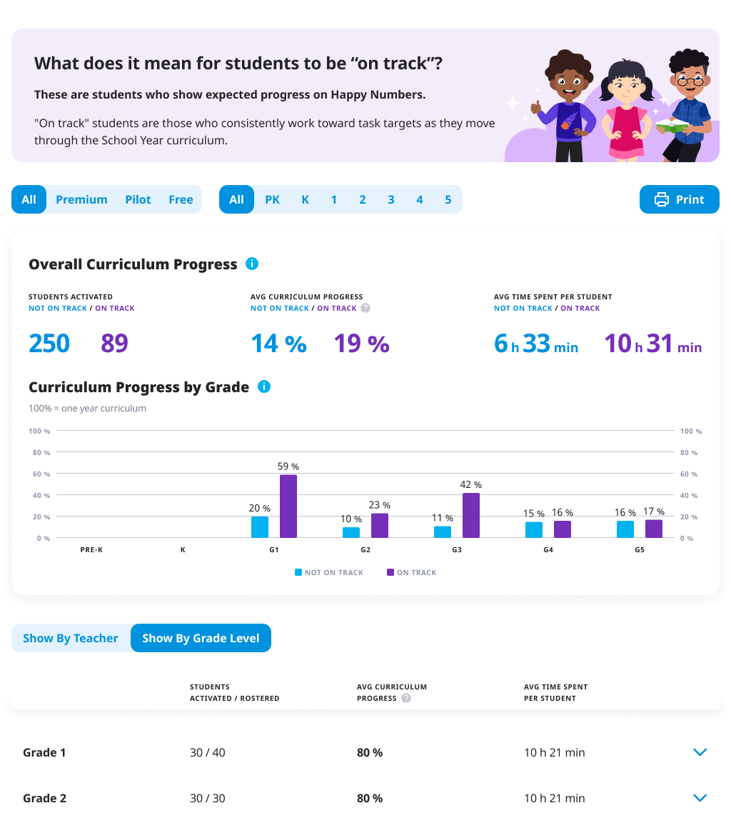
The Progress Report (For Mid-Year Reviews):
The Problem: By December, boards want to know if students are actually advancing, not just logging time
What We Built: Curriculum progression based on individualized student paths
Key Innovation: Instead of showing "lessons completed," we showed grade-level progression—a student might be in 3rd grade but working on 4th-grade material
The Insight: This addressed the differentiated learning reality—students work at their own pace, but admins need to know if they're catching up or falling behind
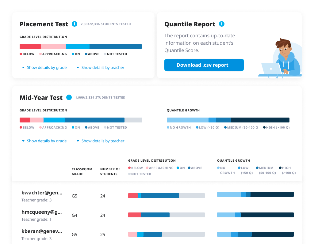
The Assessment Report (For Renewal Season):
The Challenge: Happy Numbers' internal assessments weren't trusted for high-stakes decisions
Partnership: Integrated with MetaMetrics (creators of the Lexile Framework) to provide externally validated assessment data
- Their Quantile measures are recognized by state education departments
- This gave our assessments third-party credibility
- Admins could now show board-recognized metrics, not just "Happy Numbers says students improved"
Value: This transformed our assessment from "nice to have" to "budget justification ammunition"
Phase 4. Dynamic information to boost renewals
Dynamic Dashboard
We build 4 reports. That’s a lot for overwhelmed and constantly busy admins to navigate. We knew it from the start - showing reports is not enough, we should surface certain data at a certain time of the academic year. So we’ve build dynamic dashboard:
- September — focus on activation
- October-November — focus on usage
- January — first assessment by external partner of student’s success
- February-March — focus on usage and progress
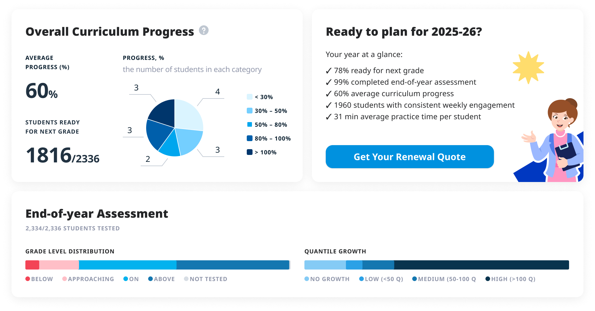
- April-June — crucial information for renewals
Renewal
Administrators in renewal season face two pressures:
- proving value
- securing budget.
We added a "Request Quote" button that seemed simple but actually automated the entire CS renewal workflow. Behind that one click: automatic quote generation based on type of the school, their usage and all possible offers and discounts, and contract routing for e-signature.
What used to be weeks of email tennis between admins and CS became a same-day process. Renewals skyrocketed.
September
May
04 The Compound Impact
The Immediate Relief. Month 1
Our CS team went from drowning in Excel report generations to actually supporting customers.
The Classroom Impact. Month 3-6
Teacher and student metrics actually improved, because administrators finally had data to act on. They could see which schools were struggling and intervene.
Renewal season. Year 1
The renewal rate improvement was significant
- Administrators had watched their investment all year
- Our CS team, freed from report creation, ran monthly workshops, created training videos, and held strategic review calls.
3 years later
The company expanded beyond math. New subjects, new teams, significant growth. But the admin portal remains unchanged—just added new subjects.
When architecture survives expansion without restructuring, you built something right.
We didn't revolutionize education or transform how children learn math. But instead we made it easier for descision-makers to do their jobs and justify investments in student success.
Sometimes the biggest impact comes from removing friction, the silent inefficiencies everyone accepts as "just how enterprise software works."
reflection